Developing a global investment marketplace
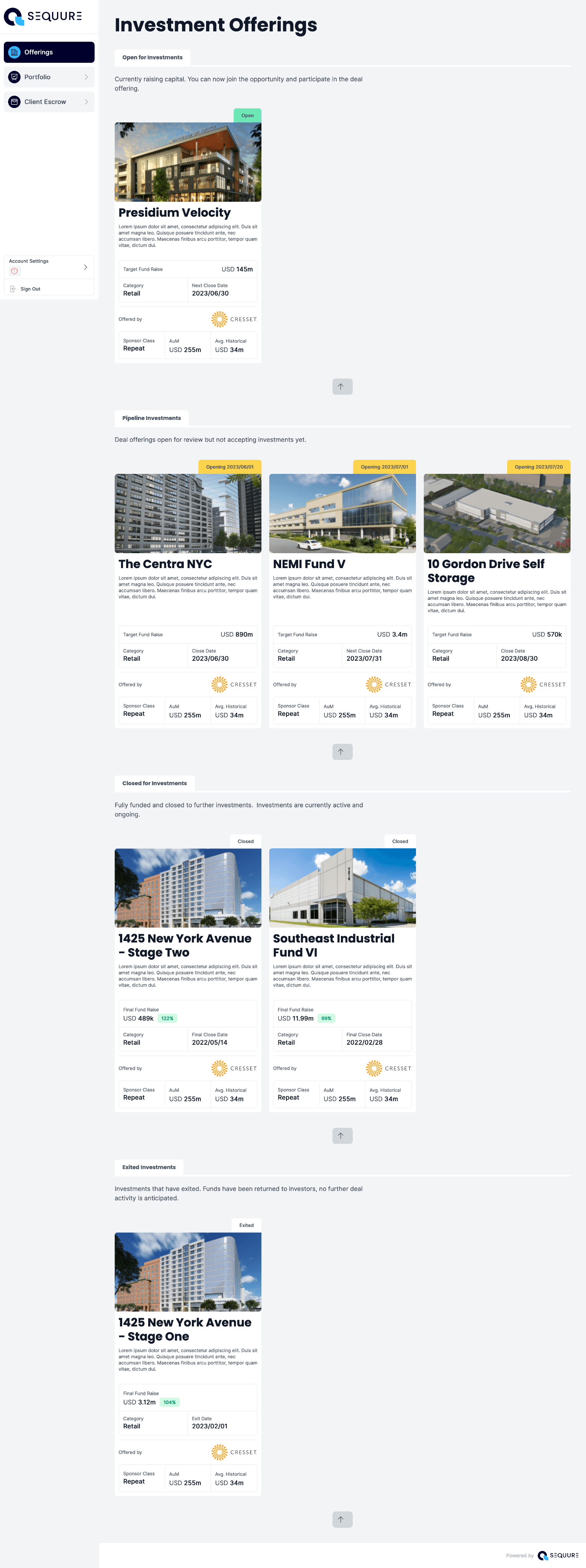
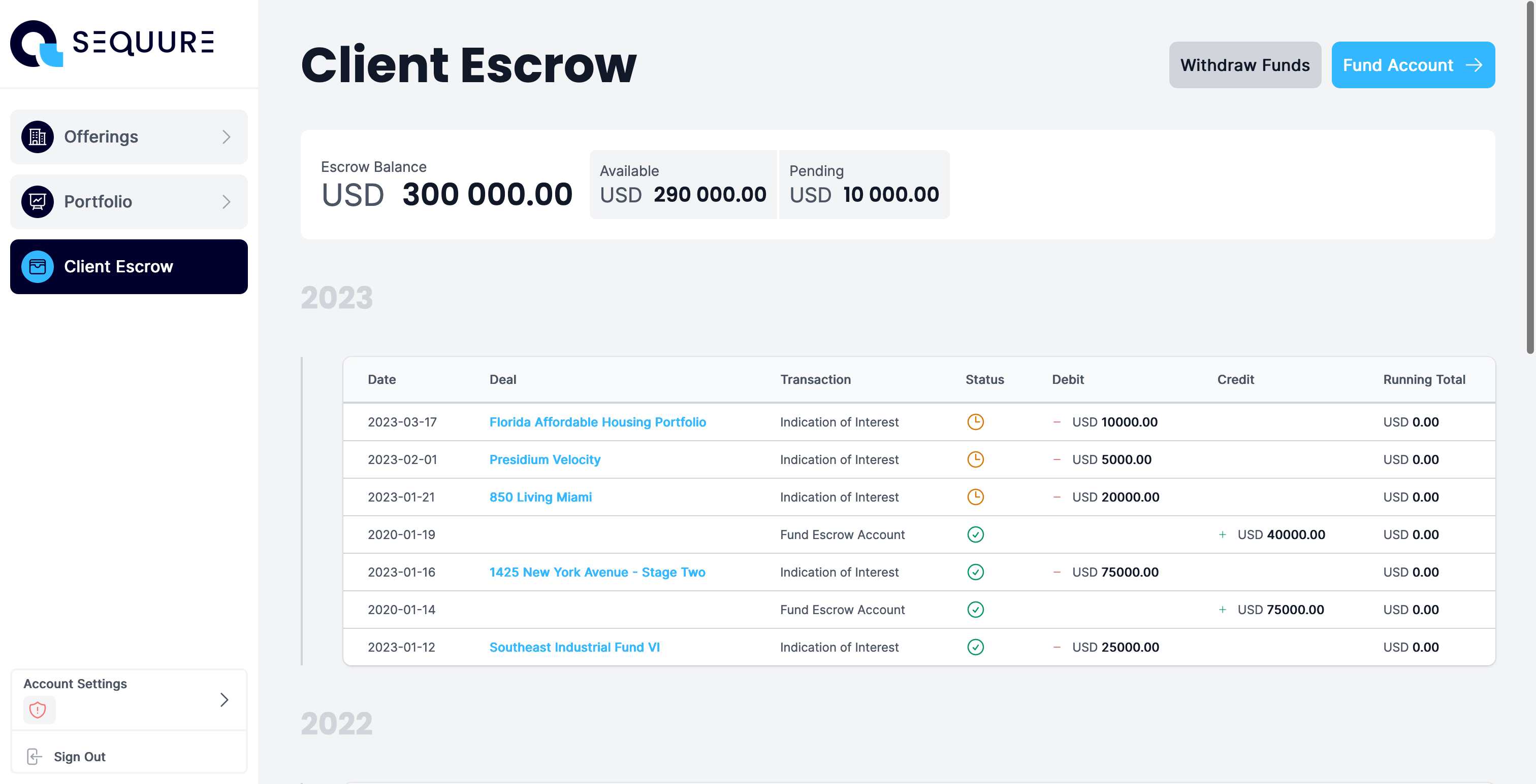
Sequure Capital connects Non-US qualified individuals and institutions to a diverse range of fully vetted, compelling US Private Equity Real Estate Investment Funds.
We had the challenge of building a web application that could facilitate that.

Learning from our own past
Our team has been working on solving the tech problem over the last 5 years, and learned a lot from the experience. When we were given the chance to build it again we took on board many of the lessons we learned.

Nuxt Frontend
Our previous iteration of a similar platform our team worked to build ran entirely on a React.js codebase. This in itself was awesome, however this was a great opportunity to explore new things and fix the issues we’ve dealt with in the past.

Choosing Vue
We chose Vue as our point of departure in terms of Javascript stack. We made the decision based on the simplicity of the component architecture, and it’s very well defined separation between logic, markup and styling layers.
Choosing Nuxt as a framework
There will always be pros/cons when considering opinionated frameworks. For our team, moving to a framework rather than building it all from the ground up was a decision we made from our experience in the past.
It was our opinion that we could benefit from the collective work of many and work with a predictable codebase that we can support much easier over time. It’s also much easier to get help, onboard others in an environment that is well documented already.
While there are things within Nuxt that we would have prefered work otherwise, the wins we got on the whole far outweighed the things we didn’t like.
We generally felt that we don’t need to rebuild things that already exist, and the Nuxt ecosystem provides so much functionality already, that we really didn’t need to.
Tailwind & CSS Architecture
I am and will always be a huge fan of CSS, but am aware that I am very much in the minority. While I originally did have reservations around using Tailwind, from an architecture and maintenance perspective, it did prove in the end to be a good fit for our other developer, and the tooling it provides is undeniable.
I made the decision to mitigate much of the Tailwind risk through implementing a BEM based, contextual architecture layour on top of it, which solved many of my maintainability concerns and provided a good foundation to work from, while keeping the utilitarian concept that Tailwind provides.
This approach works really well for me, so much so that I am implementing this in all of the work I do, along with some further experimentation.
I do believe that when you take Tailwind, and implement it into a good foundational framework of sorts, it really does shine.
Simple theming
There exists a plethora of theming libraries and extensions that plug into Nuxt, each with their own shortcoming in one way or another - the largest being that you are required to add changes into the codebase, meaning, redeploy.
The theming layer I designed made use of vanilla CSS Variables, that are baked into Tailwind itself through configuration. This is a simple, direct implementation that requires no “hacking”. We are following the rules.
We are able to then whitelabel the platform to any new client or partner, simply uploading the logos and a stylesheet file to S3, and updating the subsystem service with the links to those files.
We are then able to deploy client subsystems without having to do an entire frontend deployment, and can also make revisions in a similar cheap fashion.
Rethinking State
70% of the complexities and issues that we experienced in the previous iteration of an investment platform came from state - specifically redux. When we began exploring the potential of building the platform with Flutter, the problem moved from redux to Riverpod. State was just weird.
When I began design the new product, I deliberately did it in such a way to ensure that data responsibility would be contained as much as possible to single feature blocks, and that we could do away with sharing data as much as possible. My colleague coincidentally did the same when investigating the project structure and frontend architecture.
Instead, we chose to make use of Vue’s composition API and box our data logic into composables. This we could do in a central location within Nuxt, and keep all of our business logic contained within them.
The result of this is that our Frontend codebase is very near to my goal of having frontends to be almost considered a consumable. Our frontend handles fetching, display and posting data by simply consuming the composable.
Typescript and frontend-first data
The remaining 30% of issues we experienced in the past lie with our backend microservices and how we consumed them.
I promoted the idea of taking a frontend-first approach to data structures, meaning we built up our typescript models to make sense for frontend consumption.
The result of this is a huge reduction in client side business logic, moving most of the responsibility and risk to the backend where it could be managed from a more central location. Backend services can talk between themselves much more efficiently than having to pull 5+ endpoints, looping through all the date just to get a portfolio list together for the user.
Since our backend services are built on Node.js microservices, we could build consistent models that could be shared between backend and frontend for even more security.
This further enhanced the simplicity of our data layer, where the feature composables were made far simpler and lightweight than they ever were before. We also gained some concept of portability from this, in the sense that should we need to move from Vue.js to something else, even a whole new language, it would require far less refactoring from a logic point of view.

The Result
Building good frontend architecture is hard, and while there are still things I believe we can do better, and improvements are still on the table, this codebase is something I enjoy working on, and from a development point of view, that’s a big win!
Coupling the development work with the UX design work resulted in a platform that is delighting everyone who has touched it so far!

