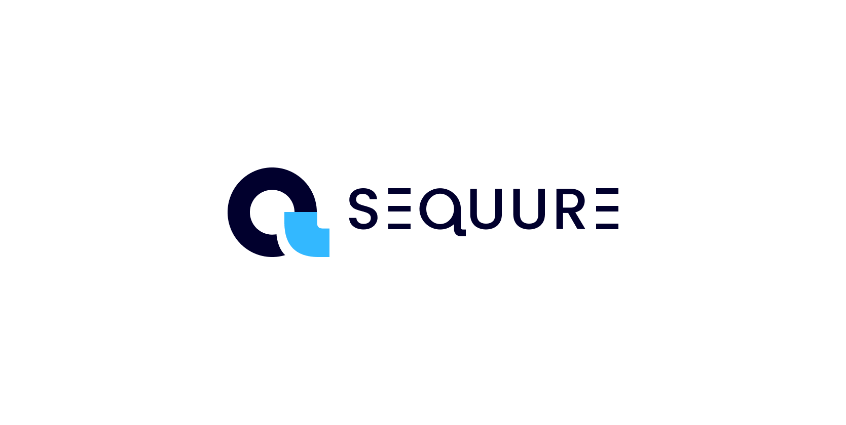
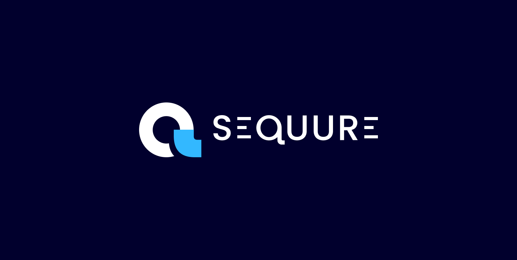
Branding for Sequure
Sequure was a start up from the ground up. There was nothing to begin with. At the same time we had to build our app, get a website up and conjure up marketing materials for two different target groups. We needed a brand, and fast.
Brand Problem
There is a school of thought within the startup industry that brand design is a lower priority than shipping your product. Sequure was contrary to that in the sense that while it is super important for us to ship our product, we also absolutely had to get supply partners and demand partners on board - not even touching on our need for funding.
Within the financial industry, within the groups we were targeting, looks absolutely matters, and it was important that we came forward with our best foot.
Approaching the problem
We still had the problem of not knowing what we were in terms of culture, message and language. It’s being worked on, but in the meantime there are meetings scheduled with potential partners. We need something now.
My approach was to adopt an iterative process, much like we do in the development space. Basically, get something out today, and make it good over time as we learn more.
Over time a few things became increasingly apparent.
The Brand Rationale
I understand Sequure and it’s position as a company that brings together the relationships between USA Funds and global investors.
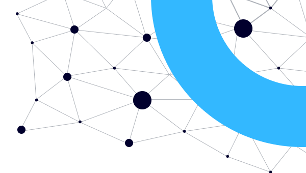
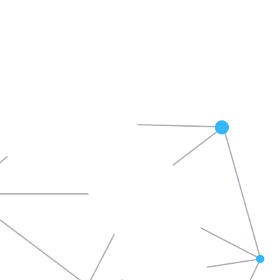
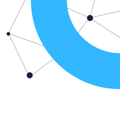
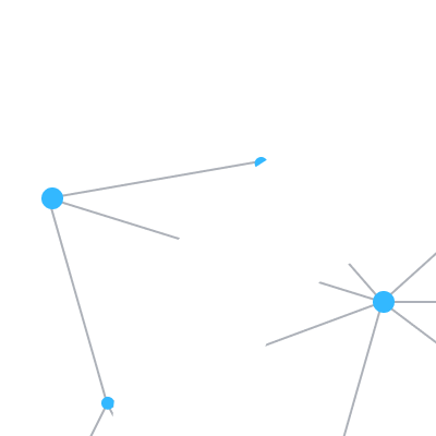
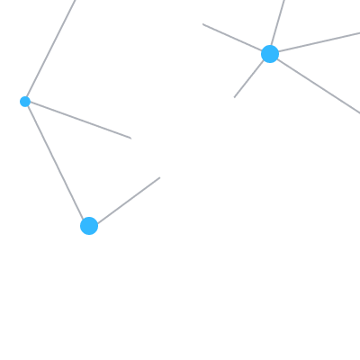
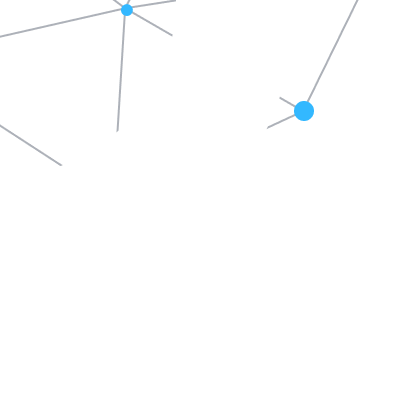
The way I see it is a network of investors and funds coming together to form a whole. It’s our technology that allows this to work in a compliant and secure way.
My breakdown of this a lot of nodes and parts that stand on their own, but if brought together will form a coherent image.
The Solution
My eventual approach after probably too many iterations was to come up with a super basic set of elements that was clean and easy to implement.
The goal was to take our limitations on board, and find ways for our branding to work well within them. I took simple colors, and simple elements that are easy to understand and place.
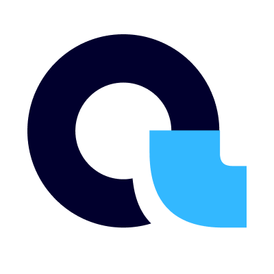
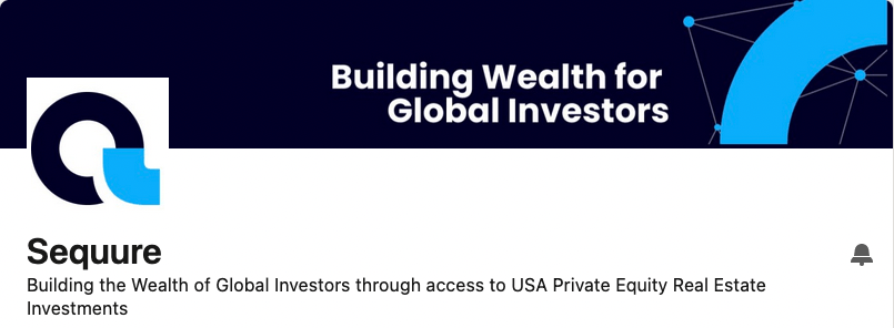
Logo
For the logo I played around with the Q, and tried to do something basic and simple.
Colors
My idea around colors was to keep it simple, with only two brand colors, that would work well with many different situations. Blue was what our founder loved, and ties well within the financial industry.
Beyond that, our platform is primarily going to be whitelabel driven, and as such I had to build a set of neutral shades that could work well beyond our own branding. For this I chose a set of neutral grays from the Tailwind color scheme, which is a set that works really well, and I use it often.
- #01002D
- 1, 0, 45
- #33B8FF
- 51, 184, 255
- #111827
- 17, 24, 39
- #4B5563
- 75, 85, 99
- #9CA3AF
- 156, 163, 175
- #D1D5DB
- 209, 213, 219
- #F3F4F6
- 243, 244, 246
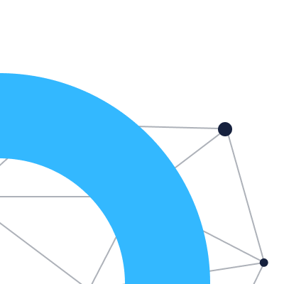
Elements
Imagery is hard to come by without a budget, and having seen a lot of the free stock around similar sites, I was hesitant to rely too much on them. Where I did use them, I felt that they had to be considered too much for non-designers to be able to work with them safely.
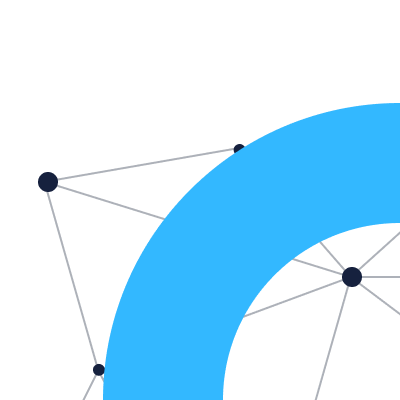
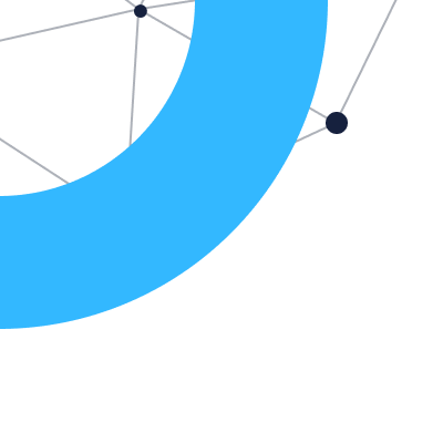
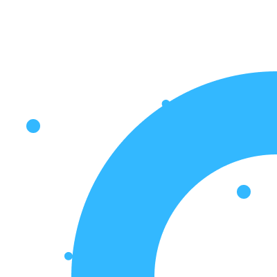
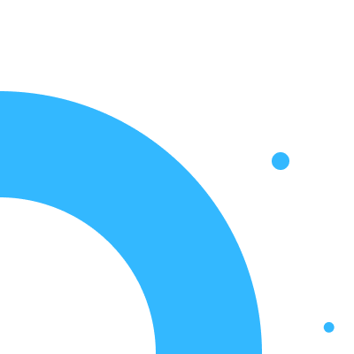
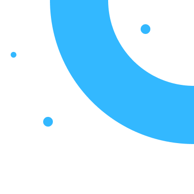
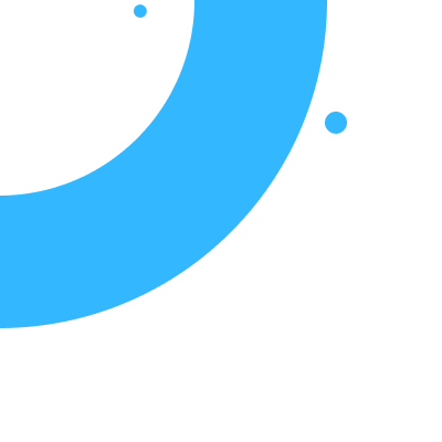
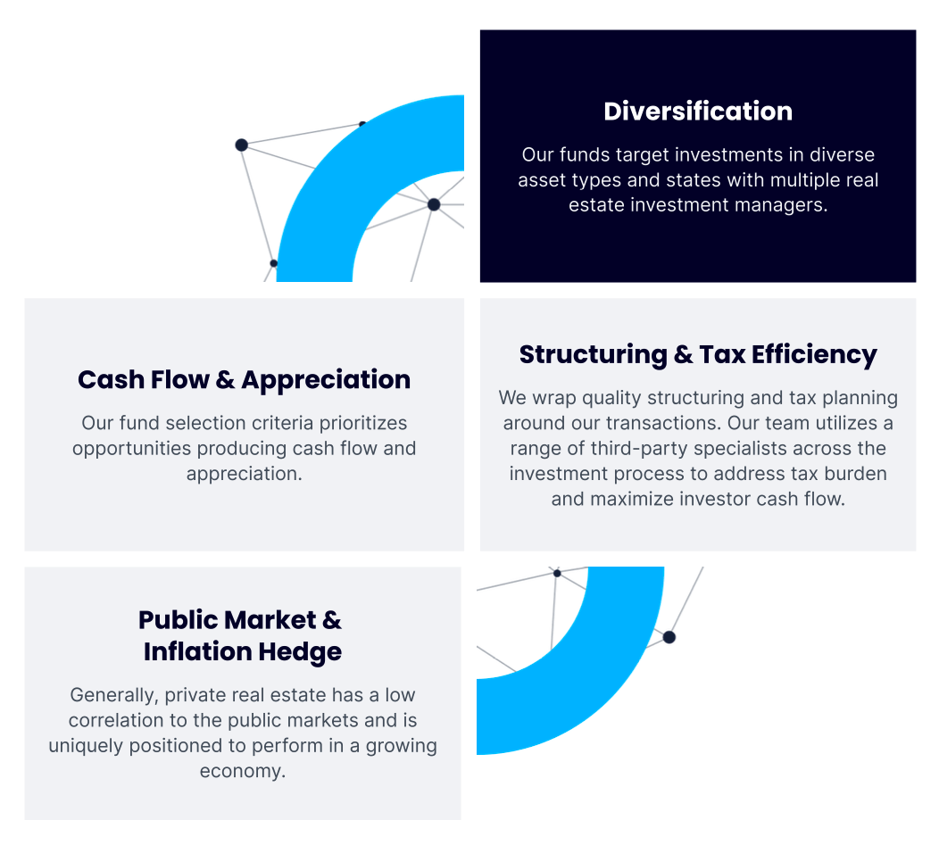
Instead I came up with the circular device, that forms a single image, but can be implemented as four distinct blocks. This is not something that’s special design wise, but if used to complete a grid does create an interesting effect. Your mind tends to complete the image, and form the whole sub-consciencely.
I prepared these blocks for a range of different scenarios, and they are super simple to understand and implement.
Layouts & Content
Because content started out basic, with short sentences and usually bullet points, I made the decision to go with larger type and a grid based layout containing blocks, punctuated with the circular devices throughout.
I could tell the story throughout the page, while still maintaining volume with an interesting look & feel.
Sticking to mainly 3 column grids, with elements that fit the dimensions predictably, meant that I could open up this to other people that had to prepare content too, without having to worry too much that it would be hard for them to do.
The Result
We ended up managing to gain consistency in many different situations, and have an identity that works well across various media.
I am confident that this is work that has legs, and will continue to grow and evolve over time, but remain true to it’s origins.
In hindsight, the iterative process didn’t work well in this environment. I’m sure that’s obvious to you, but I had to learn the hard way. Still, I learned what not to do.
While this type of work is not my area of expertise, I believe in the sum of experience and I am proud of what came out of it. I was able to adapt to circumstances, and my problem solving experience, and ability to learn new things came to my rescue.
I certainly learned a lot, and gained even more respect for all brand designers!
