
UX Design for a global investment platform
Sequure Capital connects Non-US qualified individuals and institutions to a diverse range of fully vetted, compelling US Private Equity Real Estate Investment Funds.
It was my mission to design a great product that meets the challenge above.
User Experience Challenges
Designing this platform came with several product, as well as UX design challenges that has to be focused on.
Creating an investment product of any kind, means you need to feature investment compliance regulations, money movement regulations as well as global KYC / KYB requirements. There are just certain things that have to be within the app.
The above issues translate directly to UX challenges, as a lot of these issues impacts the user at several points within the user flow:
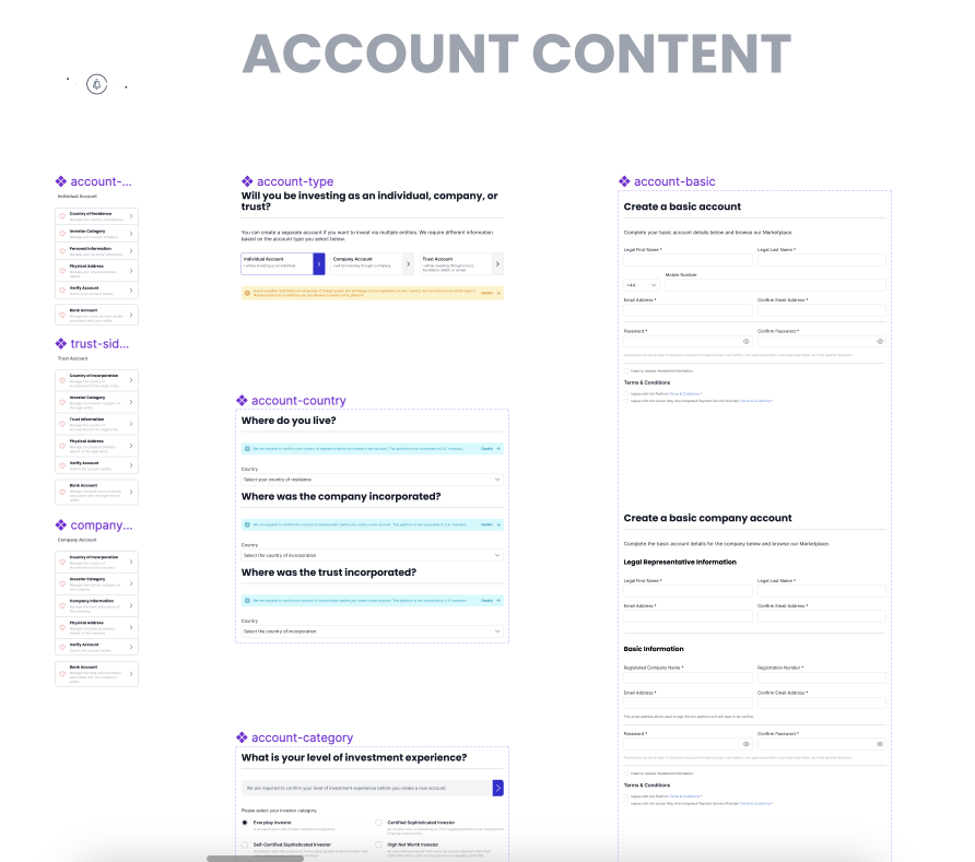
The amount of information required from investors, companies or trusts is daunting.
We can’t show any real deal information to users that have not sign up to the platform yet.
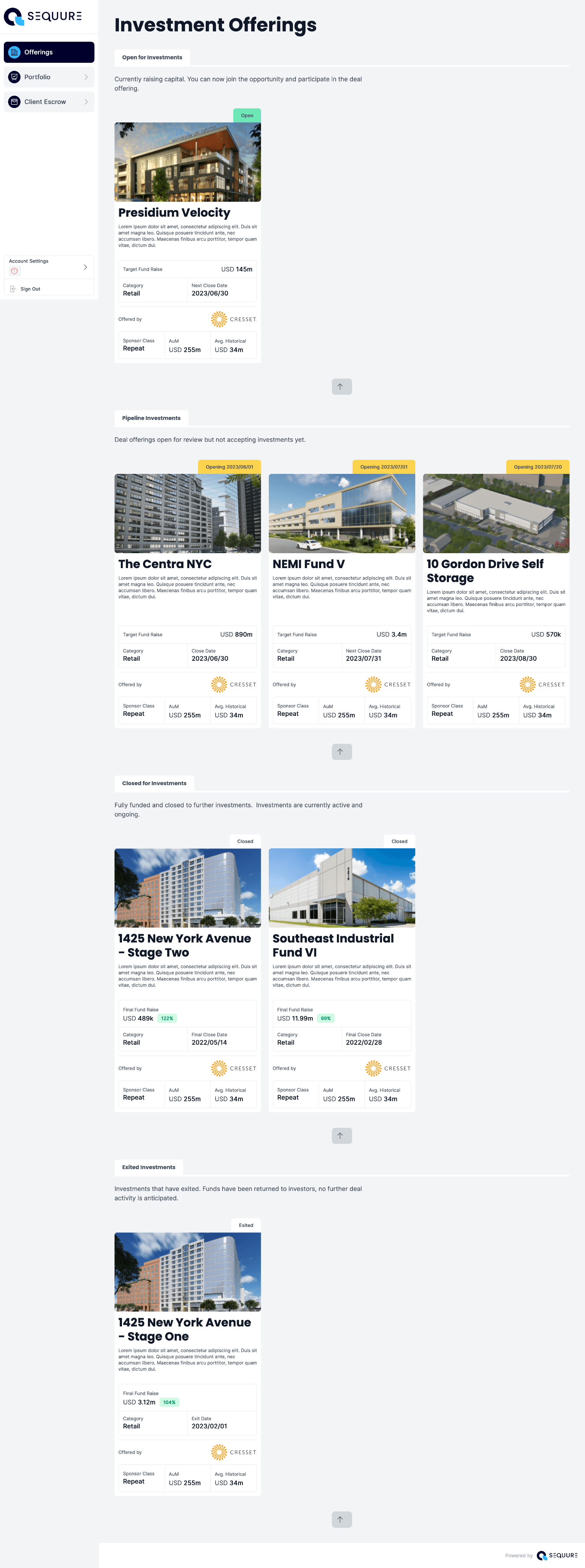
There is a lot of information involved within deals themselves, and can be daunting for a user to consume and make good investment decisions.
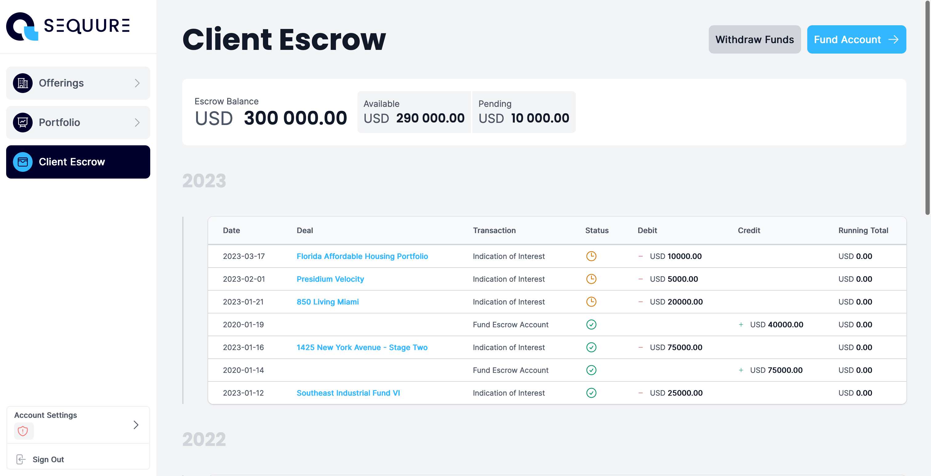
Once you have invested in deals, there is a lot of transaction data that is generated over a short amount of time.
- There are quite a few pitfalls for the user to fall into.
UX Design Solutions
It was never going to be a simple task to design solutions to some of these complex product & UX problems. My solution was to deal with complexity through predictability, consistency and simplification.
I focused my efforts on achieving two major goals:
01. Predictability
Giving the user predictable feedback on what is happening, what has happened and what is going to happen next.02. Simplification
Taking complex information and requirements, and simplifying the processes into digestable blocks of focus points.
01. Predictability
One of the key design solutions I created was to implement the sense of predictability throughout the application.
I achieved this through repeatable elements and a library of common components that can be used throughout the application.
I maintain predictability throughout the application workflow within two common components:

02. Simplification
The biggest aspect of designing this application was taking complex information, and simplifying them. There are two main categories of complexity throughout the application:
User workflow
The information we require from the user, the processes involved in processing that information.Information given
The information we display to the user.
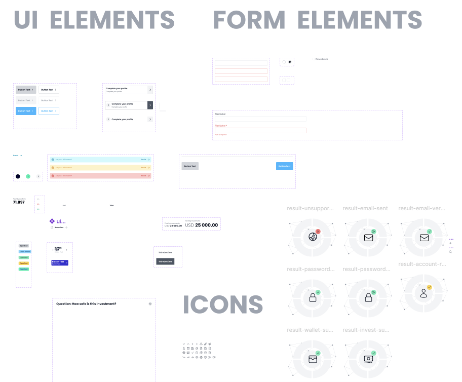
Design System
I developed a small design system within Figma that could be used to scaffold out features that match their counterparts in our Vue.js codebase.
This enabled our product owner to contribute to the project, do her own QA process and collaborate with other stakeholders in the company, without having me as a bottleneck.

Solving Specific Problems
All of the above goes a long way in establishing a solid UX foundation on which to work, and reliably remove a lot of common UX problems users experience.
That said, what we aimed to achieve with the technology required us to solve several large problems that spans across UX, Product Design & Client Experience issues.
I have listed them below as separate case studies within this main one:
The Result
Feedback in terms of UX and CX has been fantastic from the team that deals with investor issues daily, and there was a definite sense that we solved issues that plagued us in the past and created enough leg room to deal with issues we don’t know about yet.
I left feeling confident that we have established a good framework for designing features for the platform, a good foundation we can use to solve product design problems in the future and I made it easy for other people to contribute.
The company’s product owner and client relations manager actively work on the product through the systems I created, and they are empowered to solve their own problems without needing me there to help them scaffold out options.
